Sky Q first impressions: Hands-on with Sky’s new Netflix-rivalling TV experience

A comprehensive change in how you’ll watch TV, in and out of the home.
It might finally be worth dusting off that little shelf under your telly: Sky is about to give its TV services the biggest update in the company’s history. Dubbed Sky Q, on a basic level the new service adds a new set-top box to the mix, along with 4K TV support. But that’s only the half of it. If Sky has its way, Q will mean a comprehensive change to our TV-viewing experiences – melding together the modern world of live and on-demand content with multi-screen viewing.
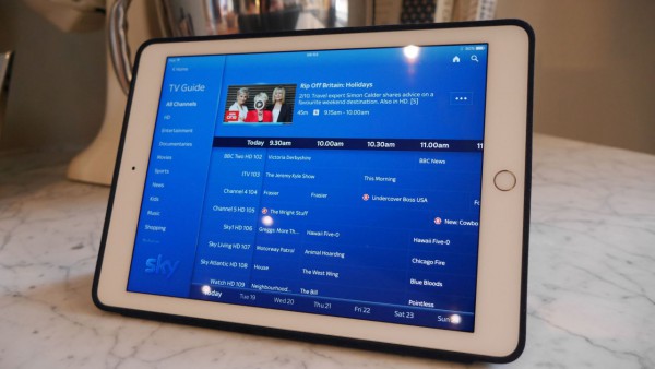
With the addition of multi-room enabling Sky Q Mini boxes and dedicated apps, Sky Q hopes to take the service well beyond the living room experience – with live, on-demand and recorded content viewable across three TVs and two tablets simultaneously. Cherry-picking the best elements of Netflix, Apple TV and Amazon Fire TV and squeezing them together into a single box, Sky Q is designed to be the ultimate menu to service our greedy, mass-consumption ways.
Of course, aside from 4K resolutions, the content itself is unlikely to change that much. And with pricing still to be confirmed, it’s difficult to gauge exactly how Sky Q will slot into our lives when it launched in the coming months. After an early play, however, we’re hugely impressed with this modern twist on the TV package. Here’s what we made of it.
Sky Q interface: Bringing Sky into 2016
Sky Q: Everything you need to know
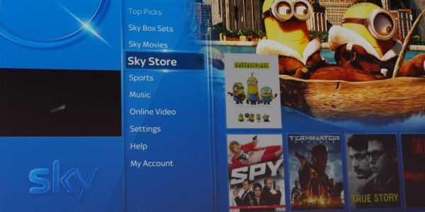
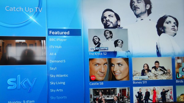
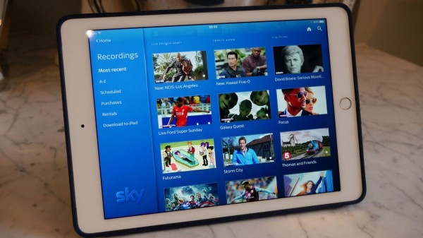
Sky has a whole new look and feel, and it’s a good one. The new ‘Fluid View’ UI instantly makes the company’s existing platforms feel positively antiquated. The tile-based system is reminiscent of the navigation panel of Netflix or Fire TV. A manoeuvrable list of content types (TV guide, recordings, catch-up, box sets), are offset by image-led tiles on the right of the screen.
This makes searching for the content that you want more immersive, engaging and less text-heavy. It’s a notable and instant step up on the current Sky+ HD set-up, and one which feels heavily focussed on enjoying on-demand content more than live showings.
With the Sky Q remote adding touch controls, this side-scrolling interface is effortless to navigate, too. It feels more intuitive and even in our short time with the service helped improve content discoverability immeasurably. There’s a pleasing uniformity to the design too. Whether accessing Sky Q through the new set-top box, Mini boxes or tablet app, it provides the same, simple to navigate, easy-on-the eye experience.
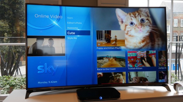
On the big screen Sky Q is like having a 60-inch iPad on the wall. It’s a design that is easy on the eye as well as pleasing to use. Dropping back to Sky+HD after sampling these feels like stepping back in time.
The whole service is geared towards a more even blend of live and on-demand content. Finally, like Netflix, Sky will prompt you to watch the next episode in a series or related content when your show finishes. It’s coming after the bing watching generation and we couldn’t be happier. Our days of painful menu hopping and search list navigating our over.
That’s not where the content-finding friendliness ends either. Scrolling through the pop-up channel listings has changed too. No longer do you have to simply just read the teaser text, but picture-in-picture previews have been added. Our only worry is that Sky Q will keep us locked to our TVs more than normal.
That said, it’s not the finished package just yet though. The push into more online and on-demand content is welcomed, but at times it feels a little forced. Dedicated channels to cute cat videos is amazing and will waste many an hour, the new ‘Apps’ section, however, is underserved. With just YouTube and Vevo services present, it’s more than a little minimalist. Sadly, this decent but barebones line up doesn’t look set to change anytime soon, with no Netflix or Amazon Fire TV shortcuts inbound.
Sky Q box: Slimmer, smarter and simply superior
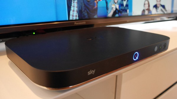
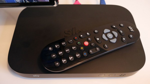
Sky’s set-top boxes have been calling out for an update for sometime. Well, now, with the arrival of Sky Q, that time has come and the broadcaster has taken the opportunity with both hands. Physically, its a typical set-top addition, pairing a matt black plastic top with the white, matt base. It’s not the unit’s looks that impress though, it’s what it can do.
Dubbed the Sky Q Silver box (there’s a lower spec Core Sky Q box, too), it lines up at half the size of the firm’s existing Sky+HD boxes. Despite its newly compact form (OK, compact is a stretch, it’s still pretty sizeable), it plays host to 12 tuners. This allows you to record up to four separate shows simultaneously, without interfering with what you’re watching live. Add to this additional Mini boxes (which come with a non-touch remote) and tablet viewing and that’s a heck of a lot of TV watching – those days of content clash should be over then.
Supporting this mass of recording options, internal storage has been given a massive bump. Running 2TB of internal storage, there’s five times more space than on current, base-level HD boxes. That’s hundreds of films and more TV shows than you could possibly want to record…
Well, unless you’re storing 4K content. With the box adding UHD support for the first time – bringing it in line with BT and Amazon Fire TV – Sky’s new service will play nice with ultra high-definition sports and movies content. But not on day one. Those who’ve already plunged money into a 4K TV will have to wait until later in 2016 for the good stuff.
Sky Q remote: Touch and voice replace traditional controls
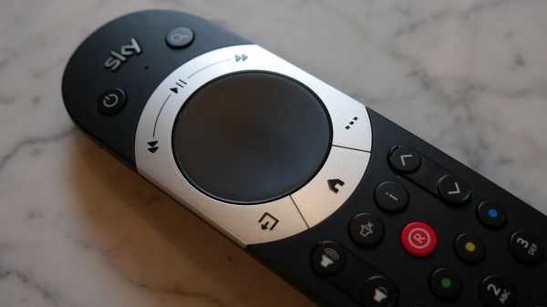
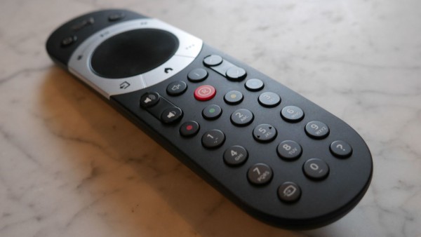
The Sky remote – arguably the company’s most iconic bit of hardware – has changed. Completely. The bulbous, tapered design of the long-standing remote is gone, in its place is a smoothed, pebble-esque peripheral. It’s essentially an oversized version of the Amazon Fire TV remote – albeit with a few more buttons.
Dominating the top of the accessory is a circular touch panel. This supports swipe gestures to let you skip quickly through the revamped UI. Using the new remote helps revolutionise the whole Sky experience. The touch-based swipe controls are sharp and responsive. The remote is comfortable to hold, too, with its curved rear slotting nicely into the palm of your hand.
Apple TV might host similar swipe-based controls, but things here are simpler, more intuitive and pleasingly responsive. We found we were whizzing through Sky Q’s new menu system without once having to glance at the remote. The touch panel is perfectly sized and something we’ll no doubt quickly wonder how we ever managed without.
It’s not just touch that’s going to revolutionise the way you interact with the Sky box. Lining up alongside the usual plethora of buttons is an integrated mic. This allows for Apple TV and Fire TV-echoing voice searches. At least it will. Again not coming on day one, the remote is future proofed for an update later in the year. As such, we’ve as yet been unable to see how it compares to Apple’s Siri commands.
Sky Q features: Moving beyond the living room
With Sky Q, you’re not simply locked into Sky’s pool of content. Yes, there’s plenty of it with the full Sky Movies back catalogues and near endless box sets. But if you’re after more online content, there’s no longer a need to activate your Smart TV or pull out your smartphone.
The new platform does play host to some content currently unavailable on your Sky+HD box – providing apps for providers such as YouTube, Vogue, GoPro and Red Bull’s channels. More interestingly, while Netflix isn’t on the cards just yet, it’s not been ruled out either – just don’t expect it anytime soon. And if you want your own content on the big screen, the new box is AirPlay friendly for casting options.
That’s not where the viewing options end, either. Sky has realised that TV viewing is no longer locked to the living room and added the ability to jump between locations, and devices with ease. This is based around the personalised ‘My Q’ tab. Through this you can pick up and put down content where you left it – irrespective of the device you last viewed it on. If you watch half a movie on your main TV, it will be waiting for your where you paused on your Q Mini-connected TV or tablet. Sky’s not the first to implement this, but it has done a nice job of it.
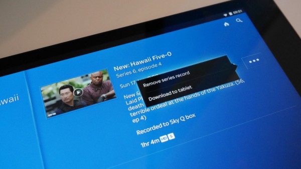
For the first time, your recordings are moving across devices, too. Set The Apprentice to record on your main TV and it will auto populate on all connected devices. It will also be available for offline viewing on your slate for on-the-move viewing. Sky Q Sync is another beautifully simple addition, and from first look, one that looks set to completely change those morning commutes, long haul flights and weekends at the in-laws’.
Although the heart of the proposition, Sky Q isn’t just about the TV system. A new Sky Q Hub router has landed, too, looking to big-up your home connectivity. As well as support for all the latest Wi-Fi standards, the fibre-friendly router also utilises power line tech to send internet over your home’s electrical network – much like the Devolo-type plug adaptors currently available.
Now, obviously given our limited demo time with the system, we’ve been unable to test this feature. However, it could well become the hidden gem of the Sky Q set-up. If it works as effortlessly as it should, this will completely enhance the home setup for many.
First impressions
Sky Q has answered any issues you might have had with Sky’s existing services, and added a few bonus features in for good measure. Bringing the TV experience into the era of on-demand content and portable viewing, it’s melded together the best features of its rivals – from a Netflix-esque tile-based interface to Amazon Fire TV-inspired 4K support – in a seamless design.
The lack of pricing at this point is a little troubling – this thing’s not going to be wallet-friendly – but other than that, a first play with Sky Q leaves few further concerns. It might not be a service that’s going to change what you watch, but it will certainly revolutionise how you watch it.


