Apple Music’s redesign makes it feel like a familiar iPod
Today Apple showed off a brand-new version of Apple music, which the company said was built “from the ground up” with simplicity in mind.
The company also boasted that the service now has 15 million paid subscribers. While most are happy with the content provided by Apple Music, the confusing UI has always been a sore spot for the service, something today’s update hopes to fix.
The new update is bright and simplistic, getting rid of the clutter found in the last version, something that should make it much more delightful to use. Instead of shoving a million songs in your face, the new version steps into the background, letting you actually interact with your music. The redesign actually feels like the old iPad app – simple and inviting.
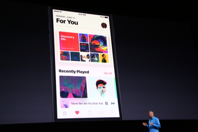
In an effort to make things less confusing, the first screen that shows when you open Apple Music is your library. This library tab will be broken up into two sections – music locally stored on your phone, and streaming tracks. Currently, Apple Music opens to the “For You” tab, which makes it hard to find the music you actually want to listen to.
The “For You” tab will remain, but is now broken up into Discover, Recently Played, and a new daily curated playlist.
One fun feature – the app will now automatically fetch lyrics for each song you are listening to so you can sing along.


