Classic games reimagined

We’ve teamed up with GAME as part of our 10-year anniversary celebrations to look back on the most defining releases from this stretch of time. And, as it’s our birthday, we wanted to do something special, so we asked some of our favourite illustrators to create their own artworks for the titles that have been keeping them (and us) battling into the early hours for the last decade…
- 1.
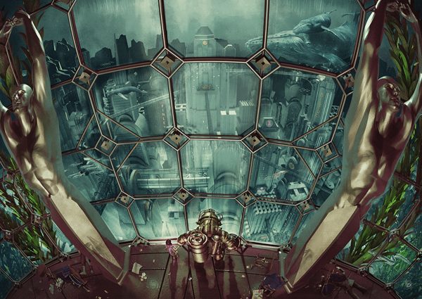
Chris Skinner – Bioshock
This is Bioshock from a whole new angle. Chris Skinner, who’s worked on projects for the likes of Marvel and DC, sweeps us high above underwater city Rapture’s Art Deco-inspired atmospherics. With the submerged metropolis sculpted in stunning detail, this cityscape feels just as immersive as the game itself. And as any fan of the series will tell you, making a Big Daddy look diminutive is no mean feat.
- 2.
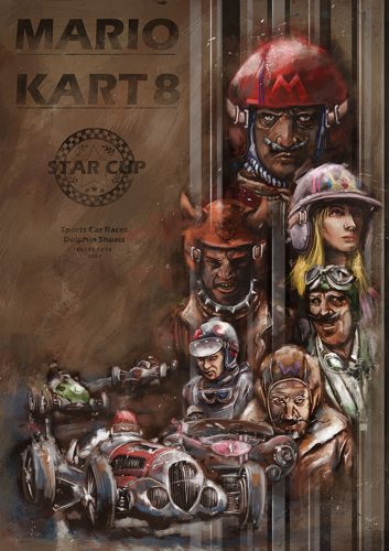
Ben Holmes – Mario Kart 8
“What’s the only thing better than a game of Mario Kart?” asks Ben Holmes. “Trying to paint what it’d be like in real life…” Reflecting Holmes’ interest in combining traditional and digital painting techniques, Mario, Luigi, Peach et al are mutated into gruff-faced racers straight out of the kind of vintage car rally your dad daydreams about.
- 3.
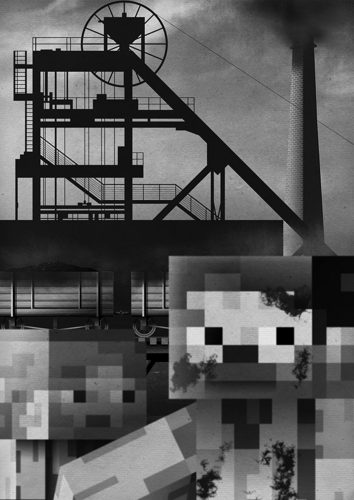
Jamwah – Minecraft
Jamwah—AKA Jamie Roberts—was inspired by an usual source: child labour. The realisation that the millions of youngsters who populate the world of Minecraft today might have been working in actual mines a few generations ago, made him think about the power games have when it comes to realising how far we’ve come since those days. The resulting visual is a suitably-blocky and stylishly-noir envisioning of the hugely-popular title’s imaginative landscape, that doesn’t shirk away from the environments that shaped it.
- 4.
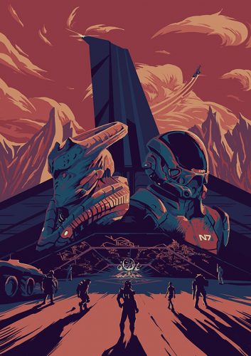
Frederic Le Martelot – Mass Effect
Crafted as a thank you from the artist to developers BioWare for a decade of intergalactic exploration, Le Martelot’s brought a Star Wars vibe to his bold redesign. “As a lifelong sci-fi fan, when the first Mass Effect came out, I was stunned by the depth and quality of its universe,” he says. Long live the high-concept space opera.
- 5.
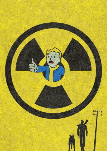
Patrick George – Fallout
Echoing the eerie-retro feel of Bethesda’s beloved post-apocalyptic series, this luminous piece of vector work is a visual slap round the chops. George might be best known for his work as a children’s illustrator but this is a suitably adult interpretation of the Fallout world’s degraded 1950s glamour. Combining ever-smiling mascot Vault Boy with third installment stoic hero, the Lone Wanderer, the result is bold, brash, and brilliantly in-your-face.
- 6.
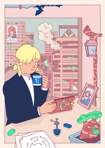
BloodBros – Zelda: Breath of the Wild
Having played Zelda for 20 years, fan BloodBros (real name Emile Holmewood) knew what he was doing when it came to giving Nintendo’s RPG series a 21st century makeover. Turning the mystical kingdom of Hyrule into a dystopian office environment that most of us play games to forget about, elfin adventurer Link is thrust into a charmingly coloured vision of the working world to come…
- 7.
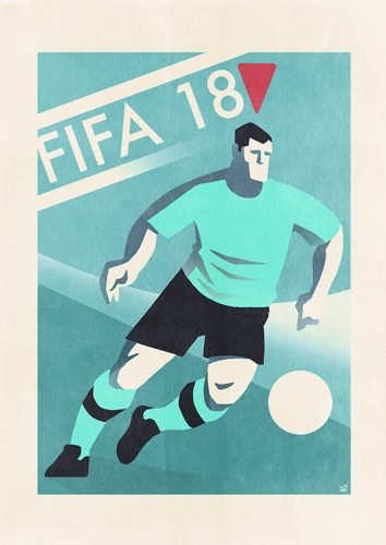
Dan Evans – FIFA
When it came to creating a new visual identity for FIFA, artist Dan Evans looked back in time. The regular ShortList illustrator turned his gaze towards vintage World Cup posters and the work of artists such as Sidney Weeks for inspiration. “He designed FA Cup posters for London Transport in the Twenties,” he says. “I was interested in seeing if the retro feel would work for a modern game.”
- 8.
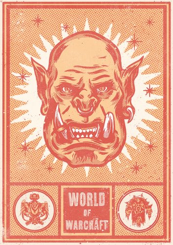
Adam Forster – World of Warcraft
Despite being a terrible World of Warcraft player, freelance illustrator Forster couldn’t wait to get his teeth into one of the most popular games ever made. Allying personal nostalgia with a reverence for vintage matchbox designs, his reconfiguration of the MMORPG’s complex iconography into a refreshingly simple tribute to a title that made us rethink just how huge games could be.
- 9.
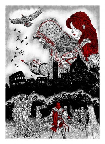
Daniel Ferst – Assassin’s Creed
Self-confessed “geek” Ferst counts comic legend Frank Miller and Renaissance man Leonardo Da Vinci amongst his influences, and that style-hopping approach to art is evident in this gothic-tinged take on the series that takes the player everywhere from the ancient ruins of the Holy Lands to 15th century Florence. It’s a dark, rugged, and Albrecht Dürer-esque vision of Assassin’s Creed II’s baroque outdoor adornments.
- 10.
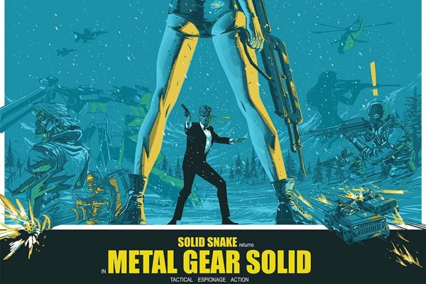
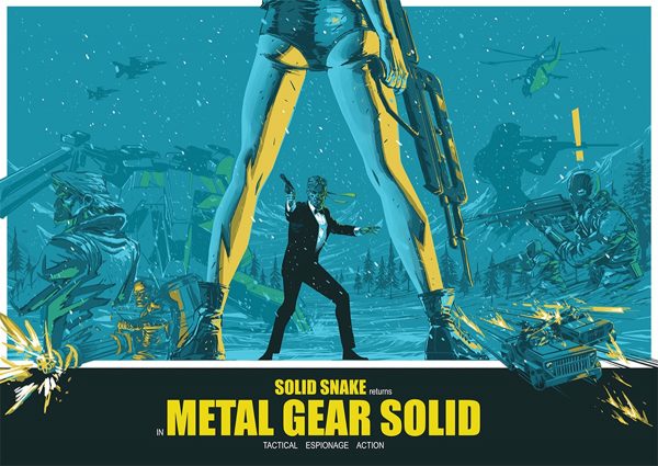
Michael Lee-Graham – Metal Gear Solid
Lee-Graham picked Konami’s masterful sleuth series for its sheer cinematic impact. The result is an image that’s as high-end as its source material. His background in alternative film posters is evident in this homage to the heady days of the Sixties’ spy movie. Casting our hero Solid Snake as a suited-and-booted spook in a snow-sodden landscape is an inspired choice.


