iPhone Emoji Are the Worst (and Here’s Proof)

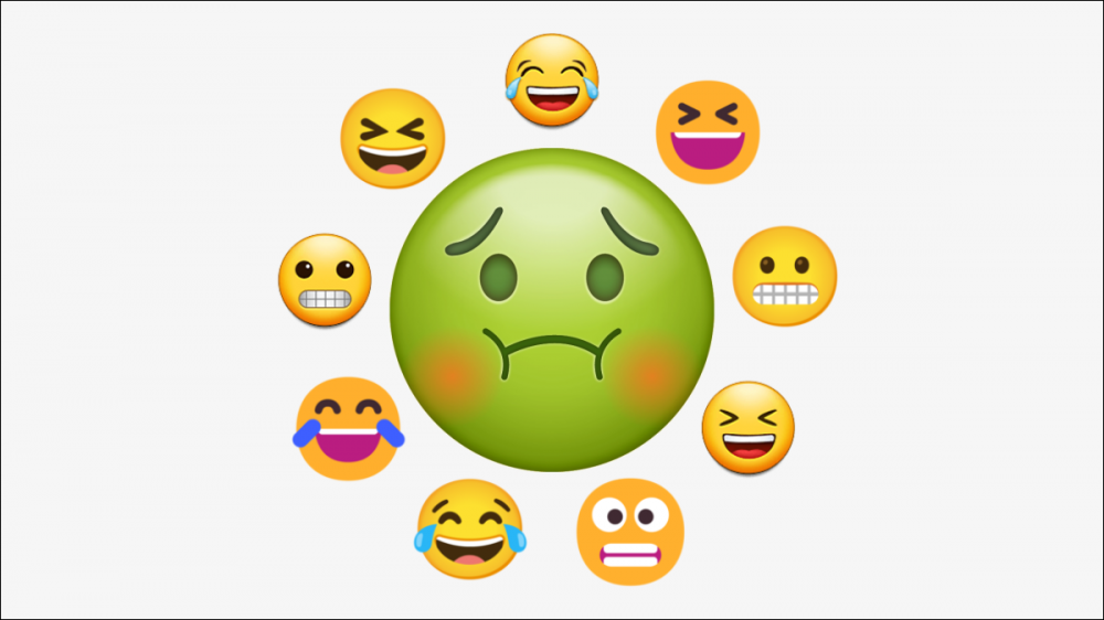
Every platform has its own unique design language for emoji. Naturally, some of these designs are better than others. For a company known for its attention to design, Apple’s iPhone emoji are surprisingly ugly. I’ll prove it to you.
When we talk about design, we’re talking about something that is inherently subjective. However, especially in software, design trends tend to follow what the general public finds appealing. In the case of emoji, Apple is being left behind with an outdated aesthetic.
RELATED: That Emoji Might Not Look the Same On Your Friend’s Phone
Why Do Emoji Look Different?
Before I jump in, let’s talk about why there’s such a thing as “iPhone emoji” to begin with. Emoji are created by the Unicode Consortium and they are a part of the “Unicode” standard. Simply put, the consortium decides which emoji should exist, and then those can be used by anyone that wants to include emoji in their software.
Here’s the catch—the consortium doesn’t actually design the emoji. It provides a basic description and some reference icons, but it’s up to the “vendors” to make the final designs. Apple is one of those vendors, along with Google, Microsoft, Samsung, and many other companies.
All of this is why emoji on iOS and iPadOS look different than emoji on Google Pixel phones, Samsung Galaxy phones, and even web platforms such as Facebook and Twitter. Everyone has their own styles to match their software.
RELATED: How to Quickly Search for Emoji on an iPhone or iPad
iPhone Emoji Are Stale
Like many aspects of software, emoji designs have changed dramatically over the years on most platforms. For example, let’s take a look at how Google’s “Grinning Face” emoji has evolved.

While all the iterations have a general “flatness” to them, they’ve changed considerably in the newer version of Android. Let’s look at Microsoft’s emoji for Windows, which have changed even more.

Here we can see some pretty major changes. Windows 8’s emoji weren’t even in color, then the mouth shape and colors changed a few times until we have the very modern-looking Windows 11 emoji.
Okay, enough with everyone else, let’s look at how Apple’s “Grinning Face” emoji has been updated over the years.

As you can see, the changes are extremely subtle. Many people may not even be able to spot the differences. iOS 6 was released 10 years ago and the emoji looks essentially the same today.
You’ll find this is the case with many of the original 90 emoji that were included in iOS 2.2, the first version that supported them. Many are simply higher resolution than they were 10 years ago, the design is identical.
Not So Timeless Design
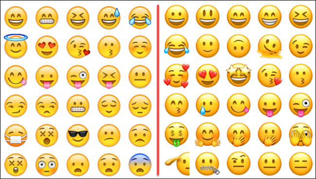
The fact that Apple hasn’t really updated the design of its emoji over the years isn’t necessarily a bad thing. Some design language is timeless. However, Apple knows its design isn’t timeless: Just look at iOS and iPad OS as proof.
iOS 15.5 looks drastically different than iOS 6 did. That old skeuomorphic design did not age well. Apple started moving away from it all the way back in 2013 with iOS 7. The emoji have lagged behind, though. They retain that high-gloss, 3D look that was so prevalent in the early iPhone era.
This is what’s so strange to me about Apple’s emoji. iOS and iPad OS have a clean, modern design that fits in well with the current UI trends. In many areas, Apple leads the charge on design trends. Why have the emoji remained largely untouched while all the other areas of Apple’s software have seen such drastic changes?
I enjoy a lot of things about the iPhone. Apple’s attention to detail can be noticed in many places and I really appreciate it. I just wish the emoji reflected that too. It’s high time you brought your emoji out of the dark ages, Apple.
RELATED: Dear Android Users, iMessage Is Better Than You Think


