10 Things About the iPhone That Will Annoy Android Users

It would be nearly impossible to list all of the differences in how things work on an iPhone vs. an Android phone. However, for those coming from Android, there are a few things, in particular, that might annoy you.
When I decided to try an iPhone for a while, I was prepared for most of the major differences. Things like the lack of customizability, a very different notification system, fewer options for “default” apps, and the significance of iMessage. However, what’s been more annoying is a handful of things I never even thought about.
iPhone Keyboards Are Bad
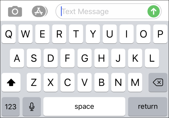
The iPhone gained support for third-party keyboards all the way back in 2014 with iOS 8. I expected the situation to be somewhat similar to Android, but I was wrong.
The stock Apple keyboard is okay but there’s so little customization. I can’t add a number row or change the size to work better with my large hands. It’s also insane to me that the period and comma keys are not in the main layout.
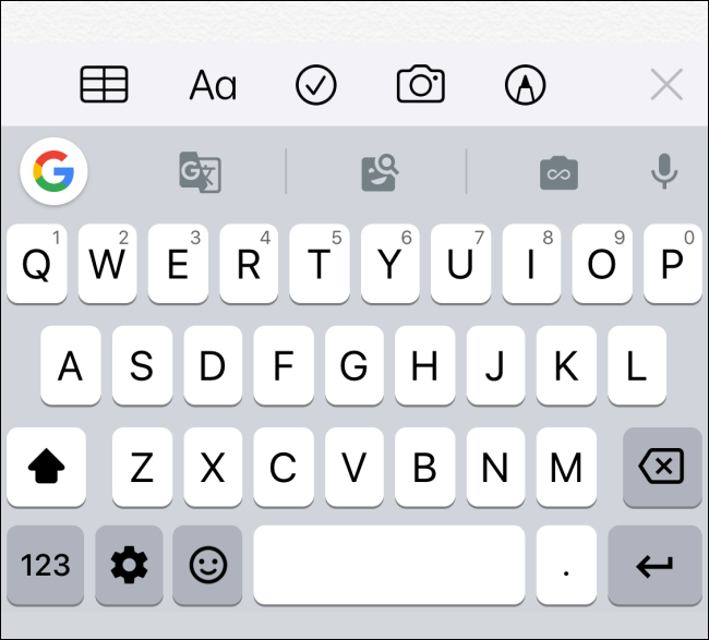
Okay, so use a different keyboard, right? I tried Google’s Gboard and quickly realized it’s a shell of its Android counterpart. It has themes and some integrated features like Google Search and Translate, but overall it just feels like a re-skinned Apple keyboard.
In general, the implementation of third-party keyboards on iOS is simply nowhere near as good as Android. iPhone users have no idea what they’re missing. Eventually, I got sick of the issues and switched back to the Apple keyboard.
RELATED: How to Install and Use Third-Party Keyboards on iPhone and iPad
Autocorrect Is Worse Than I Thought
Speaking of typing, let’s talk about one of the iPhone’s most infamous features—autocorrect. I am no stranger to autocorrect, it’s found on every Android device as well. However, autocorrect on the iPhone really is a beast of its own.
Most Android keyboards correct words as you’re typing, but the iPhone will literally correct words after you hit send. This was hugely frustrating to me in the first few days after my switch.
You can be looking at the word you want to use in the text box, then when you hit send a completely different word appears in the message. For example, I once wanted to say “jk,” but it kept getting replaced with “hi.” It’s super annoying to double-check what you typed only to see it get “corrected” after you hit send.
I eventually just turned off autocorrect altogether, but now I have to manually uppercase “I” every time I type it in the middle of a sentence.
RELATED: How to Disable Auto-Correct on iPhone and iPad
File Management Is a Pain
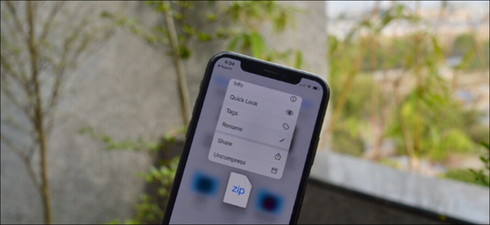
This one may not be as surprising to you, but file management on the iPhone is still not great. It’s certainly miles ahead of what it used to be but still can’t hold a candle to Android.
Apple’s default “Files” app is very simple and easy to use, but don’t expect to do any heavy-duty file managing. Plus, the third-party file manager situation is very limited. This is partly a good thing as iOS doesn’t allow apps to access your media as easily as Android. But what’s even more annoying is the lack of file support.
For example, I downloaded an M4A file from the Google Chrome browser on the iPhone. First of all, it wouldn’t play on the Google Drive mobile site (it does on Android). Second, I couldn’t play the file from the Files app or the VLC app. Something that works with no thought on Android felt nearly impossible on the iPhone.
RELATED: How to Find Downloaded Files on an iPhone or iPad
App Library is Super Restrictive
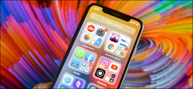
The App Library is one of the newest additions to the iPhone home screen, and I was excited to try it. I like the idea of auto-generated folders that surface your most frequently-used apps. It’s nifty to be able to launch an app without opening the full folder.
There’s one pretty big problem with the App Library, though. It has almost no customization or options to tweak. There is literally one (1) option for the App Library in the Settings—show or hide notification badges.
Why can’t I rearrange the folders like I can on the home screen? Why can’t I remove folders I don’t want? Why can’t I rename folders? Why can’t I do anything? The App Library is cool, but it’s entirely controlled by Apple’s algorithms, and that’s lame.
RELATED: How the New App Library Works on iPhone
Control Center is Underutilized
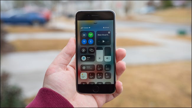
The Control Center is an obvious response to Android’s Quick Settings panel. In general, it’s a nice feature, but Apple isn’t doing enough with it. You’ll be sorely disappointed if you expect to replicate the Android Quick Settings.
Like the App Library, there’s not much customization here. You can add and remove different controls, but they’re all from Apple. Third-party apps can’t make controls. I wouldn’t be surprised if this changes in the future.
At the time of writing, many of the available controls just aren’t that compelling. It’s nice to have the basics, such as shortcuts to Wi-Fi, Bluetooth, screen brightness, media controls, and volume. But I want more. My one big ask would be a shortcut to the Settings app.
RELATED: How to Customize Your iPhone or iPad’s Control Center
No Double-Press Power Button to Launch the Camera
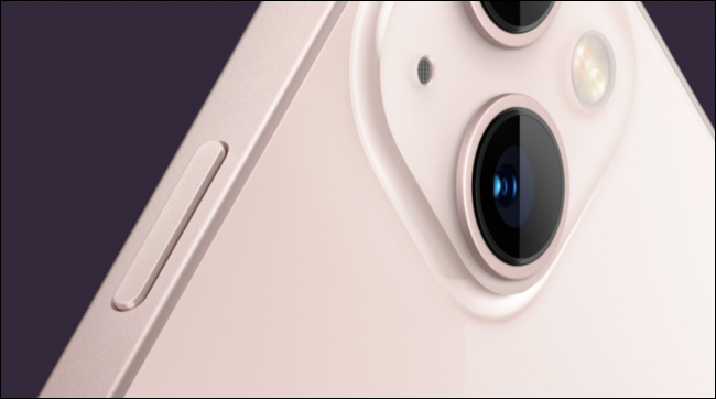
Here’s a little thing I didn’t realize I’d miss so much—double-press the power button to open the camera. This is a nearly universal shortcut in the Android world and I use it all the time. You can start opening the camera before the phone is even fully out of your pocket.
I will admit that the iPhone’s “Raise to Wake” feature is good enough that you can launch the camera pretty quickly with the lock screen gesture. Still, it’s slower than any Android phone I’ve used.
What makes this more annoying is Apple does actually let you customize the long-press action. The problem is your only options are Siri, “Classic Voice Control”, or nothing at all. Let me use it for the camera!
RELATED: How to Stop Siri from Opening When You Hold an iPhone Button
Inconsistent Gestures for the Notification Center
Notifications on the iPhone are pretty messy—I’ve gone into the problems with iPhone notifications in-depth. It’s not all about the big differences, though. There are some little inconsistencies you might notice.
One such inconsistency is the gesture for opening the Notification Center. In most places, that gesture is a swipe down from the top left corner of the screen. This is very familiar to Android users.
However, the gesture is the exact opposite on the lock screen. New notifications—ones that arrived since the last time you unlocked the phone—appear front and center. To see any of the existing previous notifications, you have to swipe up to open the Notification Center. Weird.
RELATED: Android Notifications Are Still Miles Ahead of the iPhone
Silent Mode Can Only Be Enabled With the Physical Switch
An interesting little thing that has somehow stuck with the iPhone all these years is the physical ring/silent switch. I can’t think of any modern Android phones that have a similar switch. It’s surprisingly handy, but also kinda annoying.
I was shocked to find out there are no software controls for silent mode in the Settings. The physical switch is the one and only way to silence your phone. I discovered this after my iPhone was accidentally taken out of silent mode multiple times by the action of putting it in my pocket.
What if the switch stops working? There should be some sort of “override” feature to control the ring/silent mode without needing the physical switch. There are some hacky workarounds, but nothing great.
RELATED: How to Turn On/Off Silent Mode Without the Switch on iPhone
Portrait Mode Requires Faces
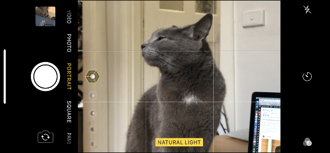
The Portrait Mode feature in the iPhone camera app is very good. It may even be better than Google’s highly touted Portrait Mode on Pixel phones. However, there’s one thing holding it back—it only works with faces.
I use Portrait Mode on Android phones to take photos of inanimate things all the time. Sometimes it’s nice to be able to heavily blur the background. It would be much more useful if Apple allowed it to work with any person, animal, or object in the foreground.
RELATED: How to Use the iPhone’s Portrait Mode
Audio Priority Inconsistency
We’ll end things with a small inconsistency with audio. Say you’re listening to Spotify in the background while scrolling through Instagram. If a video starts playing audio, the music will pause, as expected. The problem is the music doesn’t always start again when you scroll past the video.
The annoying thing about this is it’s very inconsistent. Sometimes the background audio will start playing again, other times I have to go manually press play. I can’t find any rhyme or reason for it either. Admittedly, this also happens on Android sometimes, but it stuck out to me on the iPhone.
While all of these things are annoying to different degrees, I wouldn’t say any of them are definitive deal breakers. That being said, you will need some time to adjust if you’re coming from an Android device. Apple’s philosophy on a lot of things with the iPhone is simply very different from that of Google and other Android phone makers. Know what you’re getting yourself into.
RELATED: With iOS 15, the iPhone Stays Ahead of Android in Privacy


