The smarter way to search on Android

When you want to search for something from your Android home screen, how do you do it? Do you tap the Google “pill” or search bar at the top of your screen, or maybe open up Google Assistant and enter your inquiry there?
Whatever the case may be, I’m here to tell you there’s a better way.
A recent update to Chrome for Android quietly introduced a new search widget: Chrome Search. Add it to your home screen, and you’ll see a box like this:
 JR
JRIt isn’t the prettiest widget imaginable, but man alive, is it practical. It’s faster, more efficient and more broadly effective than any of Android’s other home-screen-oriented search options.
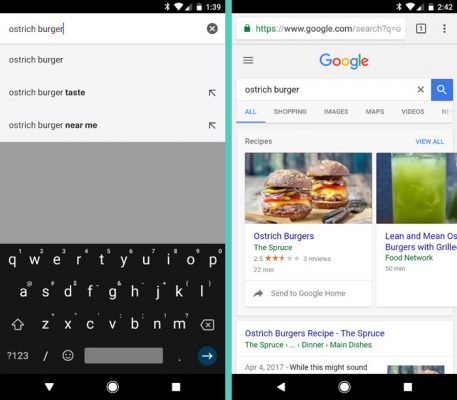
The reason? All the widget actually does is serve as a super-speedy shortcut to the Chrome address bar. Tap it, and you’ll instantly be transported to a minimalist version of the New Tab page — with the address bar in focus and ready for your input. Type in whatever you want, hit enter and bam: You’ll get your results in a regular Google search results page, right within Chrome, faster than you can say “Google Froogle.”
 JR
JRCompare that to Android’s other home-screen-based search methods, and you’ll see why it’s superior. First is the actual amount of time it takes to input a search query and get to the results. I’ve consistently found the Chrome Search widget to be about a second faster than the Google “pill” or search bar and three to four seconds faster than the Assistant, all other factors being equal.
Now, that may not sound like much — especially on the former front — but when it comes to a mobile device interaction, even just one second can be the difference between something feeling instantaneous and feeling like it’s taking a liiiiiittle too long. Trust me: This feels noticeably faster.
(And yes, I actually did a series of side-by-side speed tests, timed with a stopwatch, and averaged out several trials to account for any incidental variance. And yes, I am that dorky. In case you’re curious, for each test, I touched or activated the appropriate spot on my home screen, pasted in the same search term (which I’d previously copied) and then hit enter as quickly as possible. I stopped the timer as soon as the results appeared. The one exception was with Assistant, where I spoke the term instead of pasting it — since that’s how Assistant is designed to work by default. If I had taken the time to pull up the keyboard and paste the term into Assistant for full consistency, its results would have been significantly slower.)
But wait! The time factor is only half the story. The Chrome Search widget has an equally important advantage in how its results are presented to you.
With the Google “pill” and search bar, results actually appear within the Google app. That means (a) you can’t long-press links to open them in separate tabs, and (b) the next time you search for something or do anything else involving the Google app, your results and any subsequent pages you’ve opened will disappear from your recent apps list and no longer be easily accessible.
 JR
JRThe Google Assistant approach is more or less the same, only you first have to click on a “Search” button to even get to the point of seeing the full standard search results (assuming that’s what you’re after).
 JR
JRWith the Chrome Search widget, your results appear directly in Chrome from the get-go. You can long-press multiple links and open as many pages as you want in separate tabs. And everything you open — including the initial results page — will remain present as a tab in Chrome and thus be easily accessible via your recent apps list until you deliberately choose to close it.
 JR
JRWhen it comes to commands and more straight-forward “answer”-oriented questions, Assistant certainly has its place. But for regular searching, where traditional search results are what you’re seeking, the new Chrome Search widget is spectacular. It’s miles ahead of all the other options in almost every measure.
Give it a whirl, and see what you think.


