Twitter tweaks its design again in an attempt to woo newcomers

In an effort to better cater to newcomers, Twitter once again is redesigning its app across mobile, desktop and the web. The revamp isn’t a radical departure from its prior look-and-feel or user experience – unlike when it introduced its own stories-like feature called Moments, for example, or when began reordering the tweets in your timeline. Instead, the update involves a series of smaller tweaks to things like where your settings are located, the typography used, the shape of its icons, and more.
However, for iOS power users, there will still be a bit of muscle memory loss that’s likely to follow this update – just as there was when it relocated the revamped “Explore” section to sit where your “Notifications” tab used to be.
The same will now hold true for Settings on iOS.
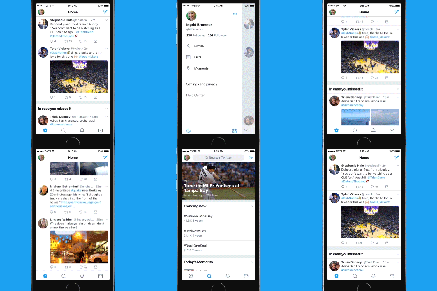
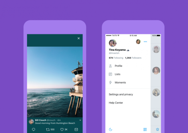
Instead of tapping over to your profile, then to the gear icon, everything Settings-related has been moved over to a new left-side navigation menu. That means there’s also no longer a “profile” button at the bottom of the app, which Twitter says reduces clutter. You’ll now swipe right on the homescreen to reveal the new menu, where you’ll find your profile, additional accounts, and other privacy options.
Android users received this change last summer, and, because of their positive response, it’s today making its way to iOS.
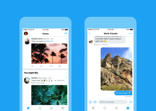
Other parts of the Twitter app have also seen some changes. Profile icons across Twitter are now round instead of square – as seen in recent testing. Plus, typography is more consistent, while headlines – like “In Case You Missed It” or “Trending Now” – are bolder to better separate them from the content.
More noticeably, Twitter has changed its Reply icon.
The icon before was a fairly standard and recognizable symbol – at least for anyone who’s ever used an email account, and understands how to respond to a message. But in an effort to appeal to the lowest common denominator of “newbie” web user, the arrow has now been swapped out in favor of a conversation bubble. (Because when in doubt, copy Facebook?)
Though not earth shattering, the change further distances Twitter from its roots. Twitter originally was an SMS-based messaging service – hence its 140 character limit, for instance. Later it became more like being able to have a group chat on the web. Turning it into a place where you can more generally post text updates, photos, videos, and now, “comment” on them makes it ever more Facebook-like, and therefore less differentiated, and less special.
Though the Reply icon is gone, the Retweet, Like (heart), and DM icons have also been refreshed, along with the Home, Search, Notifications, and DB tab icons at the bottom of the screen. But none of the others have been changed to new symbols.
Meanwhile, tweaks users have demanded for years – like editing tweets or – you know – not being threatened with physical harm for stating your politics – remain generally unaddressed. If anything, trolling has become a national pastime on Twitter. Even the President participates. And Twitter is still too much in need of an ever-growing number of unique users to do something crazy like a large-scale perma-ban of online harassers…even if a reset of its community could in the long run attract a wider audience.
After all, the company grew its user base by 9 million to 328 million monthly actives in the last quarter, and that can sadly be attributed to Trump’s tweets, for the most part.
The one change that iOS users may actually cheer today is one that’s buried under the hood. With the update, Twitter will now open web links in Safari’s View Controller within the Twitter app. That means you can more easily access accounts on websites you’re signed into, notes Twitter. But it also means if you use a Safari ad-blocker, it will finally work in Twitter’s app.
You can even configure the app to always open links in Safari’s Reader view, if you choose. (Excuse me, just wiping away tears of joy here). Technically this option is an accessibility enhancement, along with another that increases color contrast, but I don’t care. I’m using it.
Other perks that come with Safari’s Viewer include support for AutoFill, fraudulent website detection, and it will respect the Do Not Track privacy setting as configured in your iOS settings.
Twitter says all the changes will roll out today to Twitter for iOS and Twitter for Android through an app update to version 7.0.
Twitter.com, TweetDeck and Twitter Lite will also see the changes starting today.


