Why the Original iPhone Didn’t Have Copy and Paste | Inside the iPhone Keyboard Design
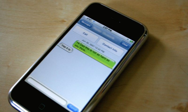
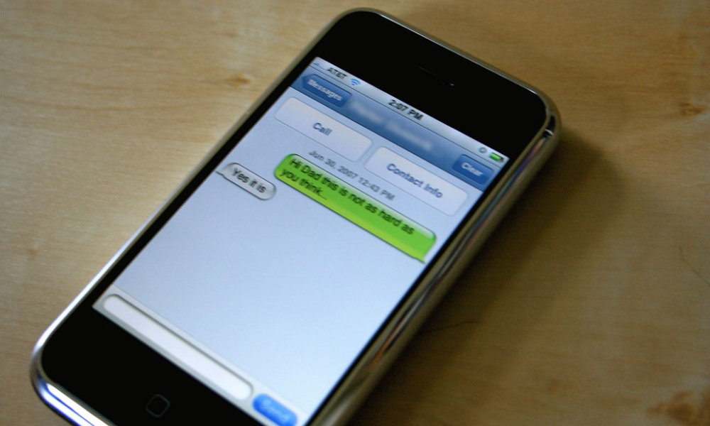 Credit: Peter Ouwerkerk / Flickr
Ken Kocienda, one of the primary engineers behind Apple’s original iPhone keyboard design, recently took to Twitter to share some tidbits on how complicated it was to build the touchscreen keyboard that we’ve all come to know and love.
In the nearly fifteen years since the first iPhone was released, it’s easy to forget how revolutionary the idea of a touchscreen keyboard was. In 2007, the world was dominated by devices like the Blackberry, Palm Treo, and Nokia E62, all of which featured physical hardware keyboards.
In 2007, the very notion of a touchscreen keyboard sparked skepticism from many corners. Without tactile feedback, many feared that Apple’s nascent iPhone would be more complicated to type on. Apple’s engineers had their work cut out in designing a keyboard that would be able to compete with the Blackberry, which was the 800-pound gorilla in the smartphone market of that era.
6 Apps Everyone Should Absolutely Have on Their iPhone & iPad – Number 1 is Our Favorite
The App Store has become completely oversaturated with all the same repetitive junk. Cut out the clutter: These are the only 6 iPhone apps you’ll ever need…Find Out More
Without a well-designed touchscreen keyboard, it’s fair to say the iPhone would have been a flop. Just about everything on the original iPhone depended on efficient text entry.
Of course, in hindsight, we all know that Apple pulled it off quite brilliantly. However, many folks don’t realize how much work went into building that crucial aspect of the iPhone.
Last month, Kocienda shared the secrets of autocorrect with the Wall Street Journal, and over the past few days, he’s been expounding on some of the other fascinating aspects of the iPhone’s keyboard design.
I made the iPhone autocorrect dictionary. I started with old word lists Apple had archived in seldom-visited internal sites. I then added all sorts of “extras”. Product names (with proper capitalization: iMac). Sports team names. Slang. Contractions (with dont -> don’t). Etc.— Ken Kocienda (@kocienda) June 19, 2022
Why No Copy and Paste?
Kocienda clears up the longstanding question of why the iPhone didn’t have cut, copy and paste with a straightforward explanation: He simply didn’t have the time to do it properly.
The original iPhone didn’t have cut/copy/paste. Infamous! The quickest explanation is that I didn’t have time to do it right. I had too much keyboard, autocorrection, and text system work to do. The design team didn’t have time either. So we passed on the feature for 1.0. https://t.co/SLncIxohkk— Ken Kocienda (@kocienda) June 19, 2022
It’s not that nobody at Apple thought of the idea. Instead, the software engineers were so busy focusing on the keyboard experience that some things had to be shelved. Copy and paste was one of those things.
The typing experience understandably had to come first, and it’s fair to say that Steve Jobs would not have accepted a half-baked copy and paste experience, so it was better to skip it entirely and focus on making the keyboard work as flawlessly as possible.
One of the most obvious aspects of this was the autocorrect mechanism, which could try and figure out what you were trying to type as you fumbled along. However, as Kocienda notes, there were many other little subtleties in the design that most folks wouldn’t even notice because they worked behind the scenes.
For example, there was no tactile feedback on the iPhone keyboard (and there still isn’t, although it’s finally coming in iOS 16). Hence, Kocienda and his colleagues decided to “charge” the buttons, providing an active area that was bigger than it appeared. The idea, as he notes, was to “give people what they meant rather than what they did.”
Kocienda also made sure that it was impossible to miss a key. If you touched the screen anywhere within the bounds of the keyboard area, you’d get something. If you tapped between two or more keys, the iPhone would try to intelligently select whichever one made the most sense based on the autocorrect dictionary.
My reasoning was that if you touched the screen, something should happen. Ken Kocienda
Another small but essential design aspect was to “warp” the screen touches to match users’ perceptions that they’re touching higher on the screen than they actually are. That’s why it’s hard to use an iPhone upside down.
The curvature of your fingers makes you think you’re touching higher up the the screen than you are. So, touches are warped to account for this. That’s why—to this day—it’s hard to target taps when you hold your phone upside down. pic.twitter.com/xl8YaxvKKu— Ken Kocienda (@kocienda) June 19, 2022
Copy and paste finally did arrive two years later, and Kocienda shares a bit about how he was involved in that, including his contribution of the magnifying text loupe so users could see what was under their finger.
Eventually, I worked with the design team to implement cut/copy/paste. The magnifying text loupe was my idea. The goal was to have your finger right on the spot where the insertion point should go, while letting you see where that was.— Ken Kocienda (@kocienda) June 19, 2022
He explains some of the other intricacies involved in the design of copy and paste. Just from a handful of tweets, it’s easy to see how much more there was to doing this right than it appears at first glance.
Of course, that’s always been the magic of Apple’s software engineering. The results are so intuitive that nobody truly appreciates how much effort it takes to make these things effortless.
For those interested in even more of these nitty-gritty design details, Kocienda has published a book, Creative Selection: Apple’s Design Process During the Golden Age of Steve Jobs.


