How to Reorder the Pop-up Menu in iMessage

 Credit: oasisamuel / Shutterstock
Any significant change to the interface of a popular app takes a bit of time to get used to. Still, some users aren’t happy. One feature many users have overlooked is the ability to reorder the items in the iMessage pop-up menu. This allows you to prioritize what you most commonly share via iMessage.
The Old iMessage Interface
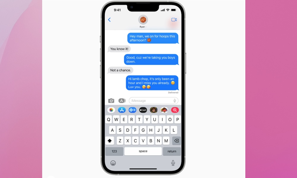
If you recall, the previous iMessage interface from iOS 16 looked like the image below. Several icons for sharing photos and other content were located above the keyboard, with the button for sharing photos easily accessible on the left-hand side.
No Subscriptions – Get Microsoft Office Lifetime Access for Just $49.97
Even Microsoft tries to nudge you toward paying monthly for their Suite 365. The good news is that you don’t have to. iDrop News readers can get lifetime access to MS Office at 85% off the normal price…Get It Here


You could access more iMessage apps by scrolling to the right, and it was possible to reorder these, but most people never bothered.
The New iOS 17 iMessage Interface and How to Customize the Pop-up Menu

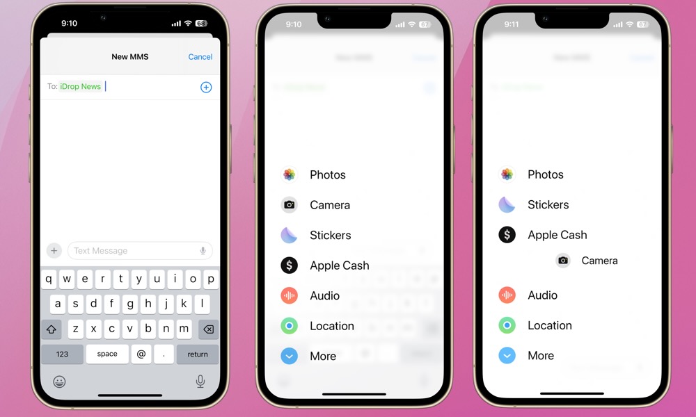
As you can see, the task bar above the keyboard from iOS 16 no longer exists. In its place is a plus (+) icon next to the text box. While it’s less cluttered, it also requires an extra step to share a photo.
To share a photo, access your camera, share your location, or share from another iMessage app, tap the plus icon. A new pop-up menu will appear, and you can select the function you want from here. You can swipe down or tap More at the bottom to share from additional apps.
However, you can also re-order the icons in this menu. To do so, simply press and hold an icon, and you’ll then be able to move it up or down the list, similar to how you reorder apps on your iPhone screen. You can also re-order apps in the “More” screen in the same way, or move an app from “More” to the main pop-up menu by dragging it to the top of your screen to push into the main menu. You can also drag items off the main menu to hide them by doing the same thing in reverse, which is handy if you want to simplify things.
One More iMessage Photo Sharing Trick
One of the primary complaints of this new interface is the extra steps required to access and share photos. After all, most users probably share photos via iMessage more than anything else. However, there’s a simple trick to expedite sharing photos. Press and hold the plus (+) icon rather than taping it, and your photo library will appear right away!
We agree this change to iMessage felt a bit strange at first. Hopefully, understanding how to reorder the menu and quickly access your photo library helps ease the transition. As Apple continues to innovate, we anticipate greater sharing capabilities via iMessage are on the horizon. At that point, the iMessage pop-up menu will likely feel more intuitive and efficient for everyone.


