Google Search Is Testing a Strange New Redesign


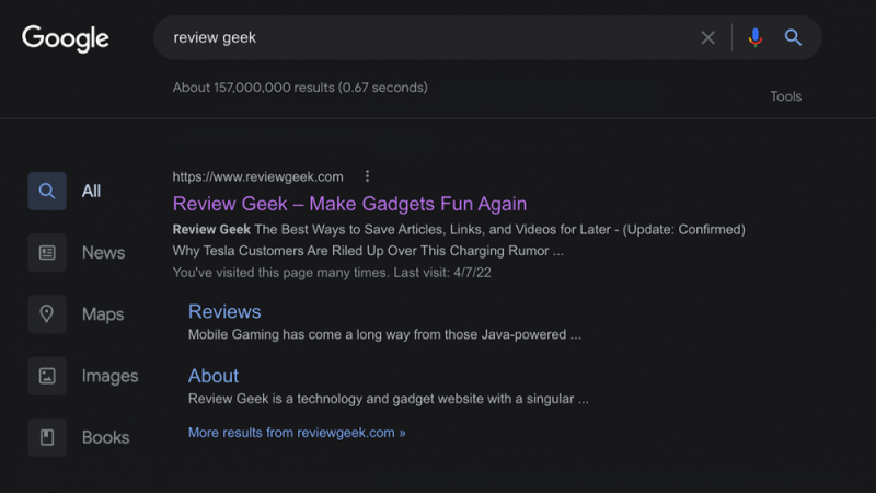
Your Google Search results may look a little different today. In what appears to be an A/B test, Google Search is turning some users’ filter row into a sidebar. This new sidebar features prominent buttons for Maps, News, Images, and other standard Search filters.
The gang at Google loves to noodle around with redesigns, much to the chagrin of some users. But this sidebar seems like a decent idea. It takes Google’s useful search filters out of that tiny horizontal row and sticks them in a big, clean column. Less experienced users may find this design more intuitive, as it’s certainly easier to read than the old filter row.
We’ve seen Google test similar ideas in the past, though this particular redesign looks like it may be intended for touch displays. That said, we couldn’t get the redesign working on our machines or find any information on it within Chrome’s flags.
Now, some users experiencing this test aren’t happy. One Reddit user complained that it’s ugly, while another doesn’t like how the old-fashioned filter row reappears in Google Images (a sign that this is an early test). My only major concern is that search filters will be less accessible to experienced users, as the sidebar is further from the search box than the old filter row.
Unless this redesign is triggered by a Chrome flag (which we couldn’t find), it’s probably applied to users at random. Bear in mind that Google may change or abandon the redesign depending on how it affects user activity.


